Falling in love with styled-components
February 06, 2020
I’ve recently started a new role and upon joining the team I’ve discovered that the project we are working on is going to be using styled-components.
I’ve heard of styled-components before but have always shied away from learning more because I worried it may just be another fad and it was something else to learn and I already knew how to do what I want in CSS.
What’s the difference between this and using CSS?
You probably already know that in React you can import .css files to apply styling to elements within your components. You can do this using standard css selectors based on html elements, or using your own classes or ids for elements.
With styled-components you still write CSS in exactly the same way (well actually you get the bonus of using SCSS so it can actually be more powerful than a standard .css file import). The difference can be found in the way you use it.
Here is an example of how you might import a .css file

And here is an example of the same thing using styled-components
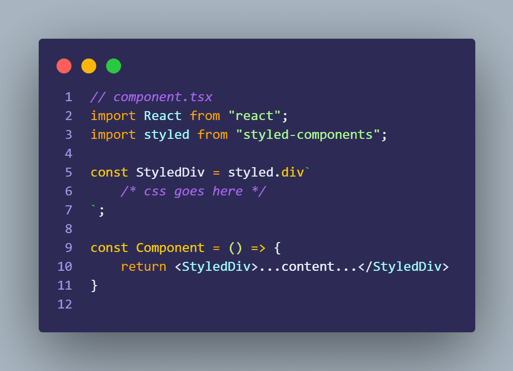
As you can see you are still able to achieve the same thing, but you can extract the styled component into it’s own file and re-use in other components.
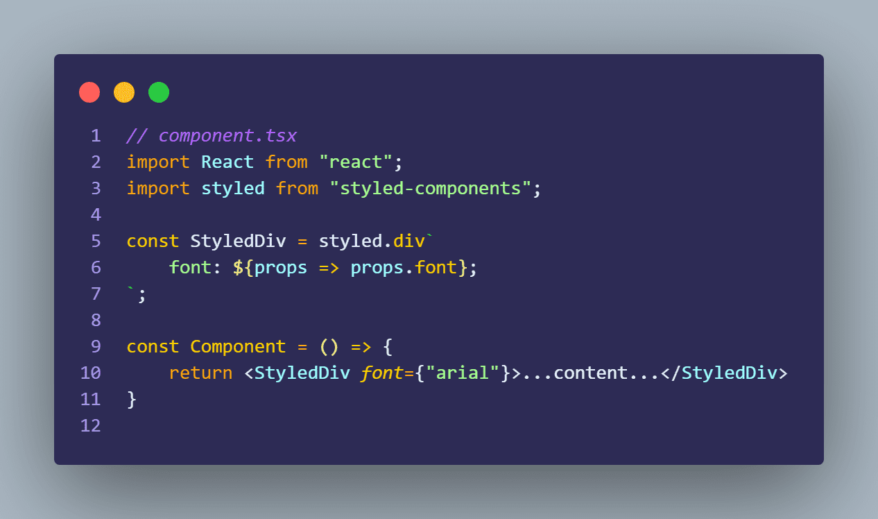
Props
You can pass props into your styled-components meaning you can override values based on the usage of your styled component.
This can be really handy when reusing components if you want them to do the same thing, but look slightly different elsewhere in your app.
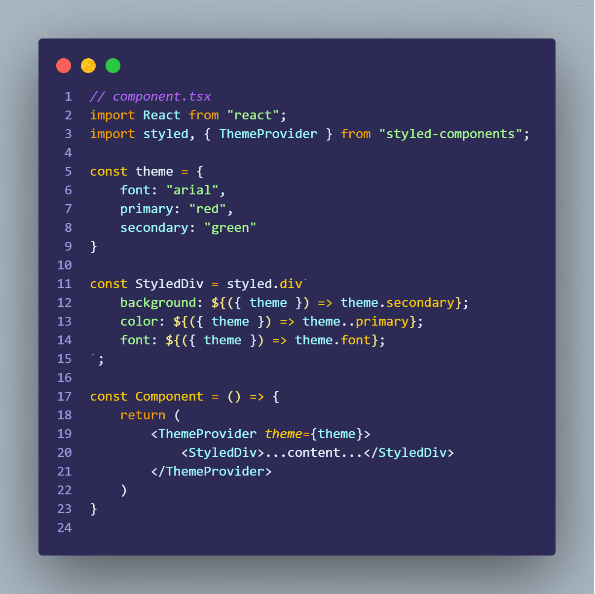
Themes
Another powerful feature, is the ability to create themes. This allows you to set default values which will be used over and over instead of setting them in every styled component. This also means if you wish to change a color or a font, you can change it one place and your whole app will look different rather than having to find each rule individually and risk missing one.
Added bonus that I found
You get the added bonus that styled-components generates a bit of extra css when it renders in the browser for you.
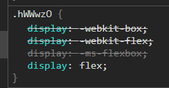
An example of this which I think is great is when using a flexbox layout.
If you set display: flex; on an element in styled-components, it will actually add the webkit equivalents to ensure cross-browser support.
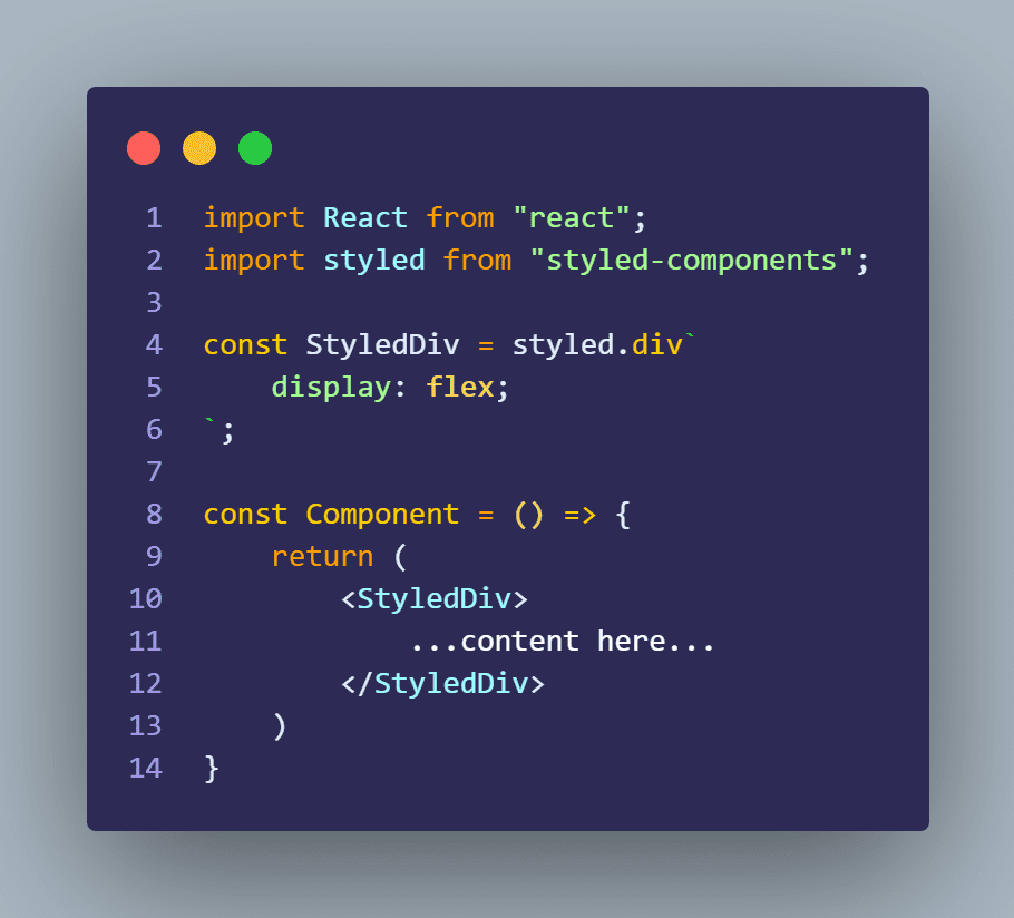
Notice we only set display: flex; and nothing else.
This is what you will see in Chrome DevTools:
Takeaways:
- I was an idiot for not being brave enough to try this sooner.
- It’s actually so easy once you understand the core concepts and I would urge you to try it if you haven’t already.

Sean Barnard, software developer at Innovyze.